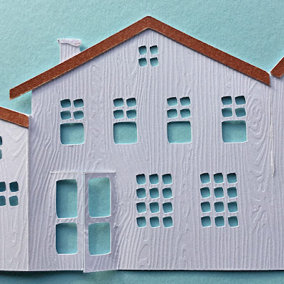
Hello, today I'm over on the Silhouette UK Blog with a post about using the overcut feature in the Silhouette Studio software. It features this beautiful folding Zig Zag Village Card by Marji Roy. The card design is fabulous, but I didn't cut it very well first time around. On the second time around I used the Line Segment Overcut feature and the improvement was amazing!
If you look closely, you'll see that the squares and rectangles are not really square - all the corners are rounded.
 |
| First attempt with Overcut turned off |
When I used Overcut (with all other settings the same) the cuts were crisper and more square.
 |
| Second attempt with Overcut on |
The post over on the Silhouette UK Blog describe the feature and explain how, and where to use it.
The overcut feature also assisted in cutting out the teeny tiny wreaths successfully.
These were enhanced using my favourite embossing powder - more effective than cutting them out from metallic card.
I'll be making a few of these for the special folks on my Christmas card list.


7 comments:
WOW Janet, this is amazing.
Hugs
Linda xxx
Amazing card, Love the litle wreaths on the doors. May have to buy this one for next year.
Sylv xx
Oh wow just stunning
Such a fabulous and detailed project Janet.
Laine
x
Amazing the difference a change in settings will produce. Your village card looks fab, and the wreaths are great as well.
GG
Hi Janet this is just amazing. I love it. Have a great week. Take care. Hugs Jackie
A fabulously decorative card Janet. The village looks wonderful and the textured card is a perfect choice xx
Post a Comment